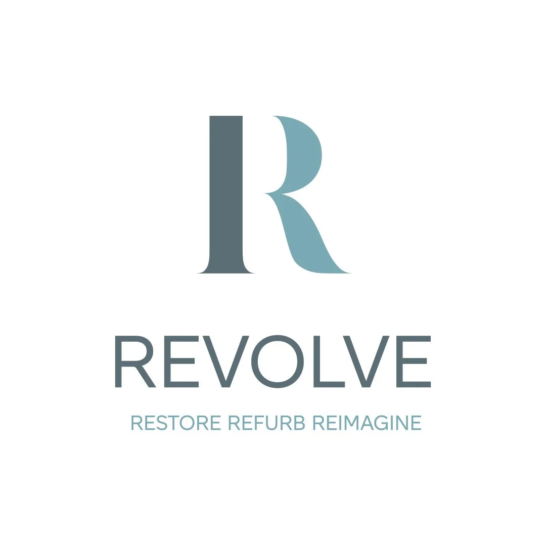
Revolve - Restore. Refurb. Reimagine.
Revolve approached this rebrand with a clear vision: to better reflect their expertise in restoring, refurbishing, and reimagining interior spaces. The challenge was to create an identity that felt both elevated and accessible—one that spoke to their practical approach and creative edge.
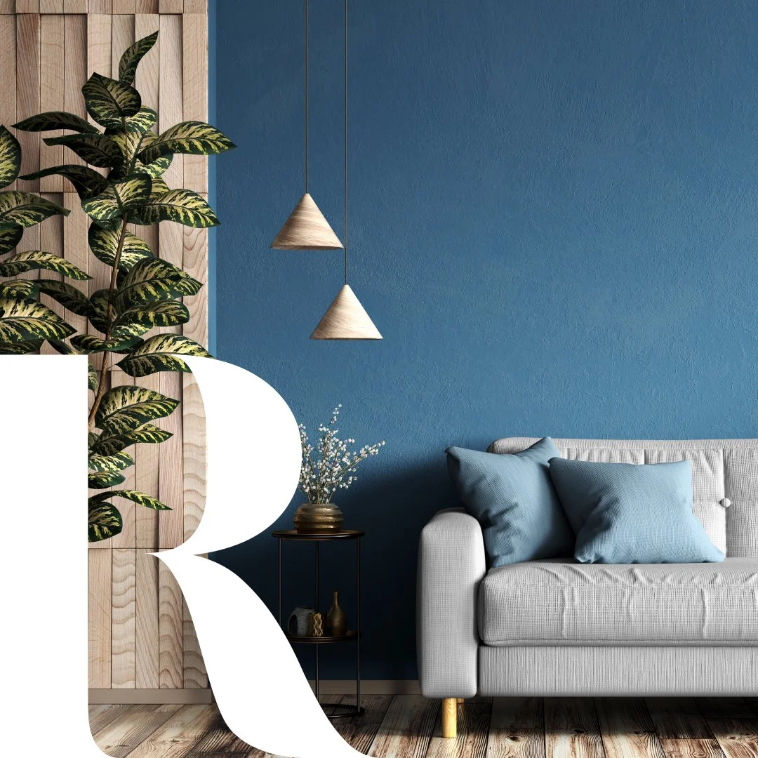
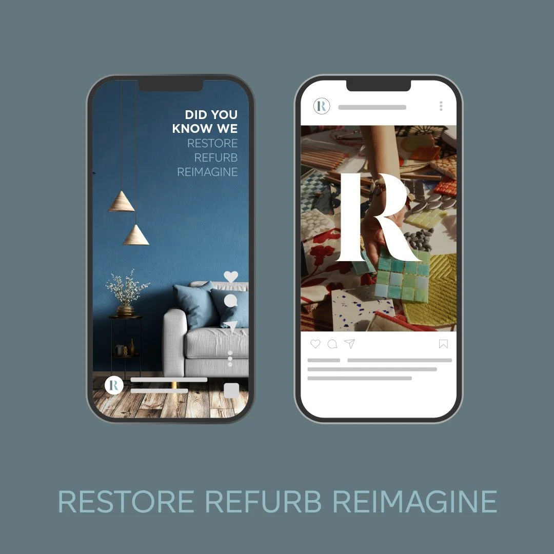
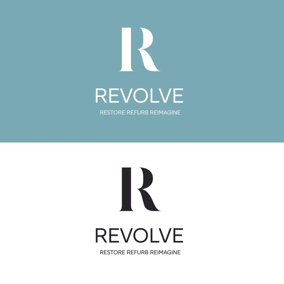
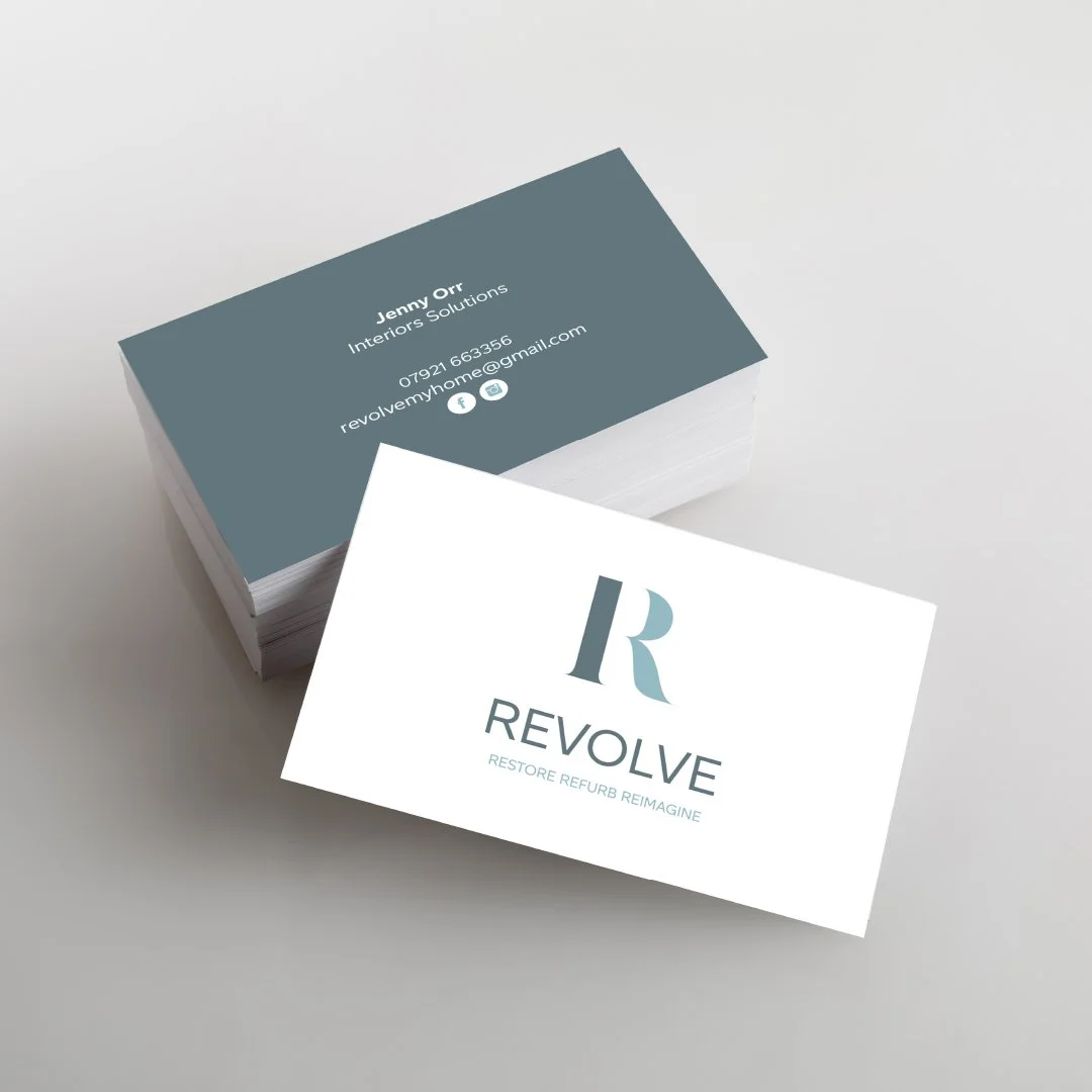
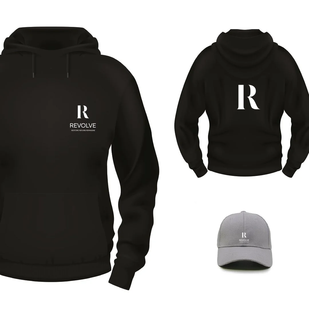
At the heart of the new brand is a single, powerful element: the letter R. The R became more than just an initial; it evolved into a distinctive brand asset that anchors the entire identity. It stands for Revolve, but also for their new tagline: Restore. Refurb. Reimagine.
This triple-R mantra captures the essence of what Revolve does best—transforming tired spaces into functional, stylish environments that reflect each client’s unique vision.
The visual identity is clean and confident, allowing the work to take centre stage while the R symbol subtly reinforces the brand’s purpose across every touchpoint.